Decorative plaster or paints tinting: NCS, Pantone, RAL color models
Painting surfaces in modern interiors remains popular, and it's not always desired to paint walls in pure white or use the number of shades specified by the manufacturer. In such cases, color matching is necessary. What is this process, how does it work, and what do color schemes and palettes mean?
What is Color Matching and Why Is It Needed
Color matching is a technology that allows you to give white paint the necessary shade. Color matching is done using special equipment that ensures precise color reproduction, and the shades themselves are selected based on international color charts and color schemes.
Mechanical color matching simplifies working with paint and varnish products because it uses not only standard but also fashionable colors for custom interior design.
Periodically, there is a need to update painted areas, and you need to buy the same shade that was applied before. However, it may not be available, which is why color matching is ordered based on previously specified parameters.
In addition, it is not always possible to visually match a particular shade. Visually, two identical paints can appear different but give different colors when applied to walls or ceilings. To avoid this, high-precision color matching is used to reproduce shades identical to those previously used or needed for coverage.
For color matching, both a white base for obtaining pastel or medium-saturation shades and a transparent base that gives bright, precise, juicy, and pure colors can be used.
Color Standards: Understanding the Features
Color systems are standardized color charts that define shades. They are used to simplify working with color and are a universal code that makes it easy to identify the required shade in any field of activity.
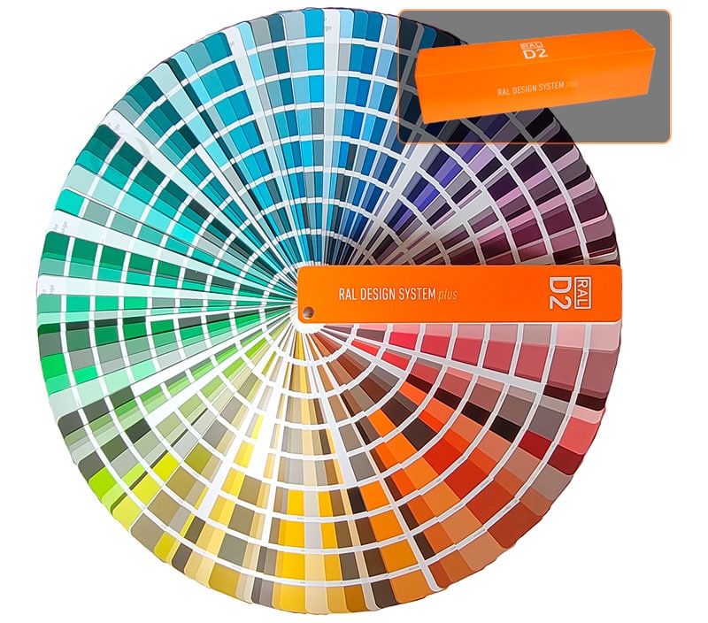
RAL
This color chart or color standard was developed in Germany in 1927. It is named after the committee responsible for its production, the Reichs-Ausschuss fur Lieferbedingungen. The development of the scheme was done at the direct request of manufacturers of paint and color products.
According to the German system, the color space is divided into zones, and each color has its own numerical index. This catalog is distinguished by high quality. Each shade is accompanied by additional information and usage examples, which simplifies its application in various fields of activity.
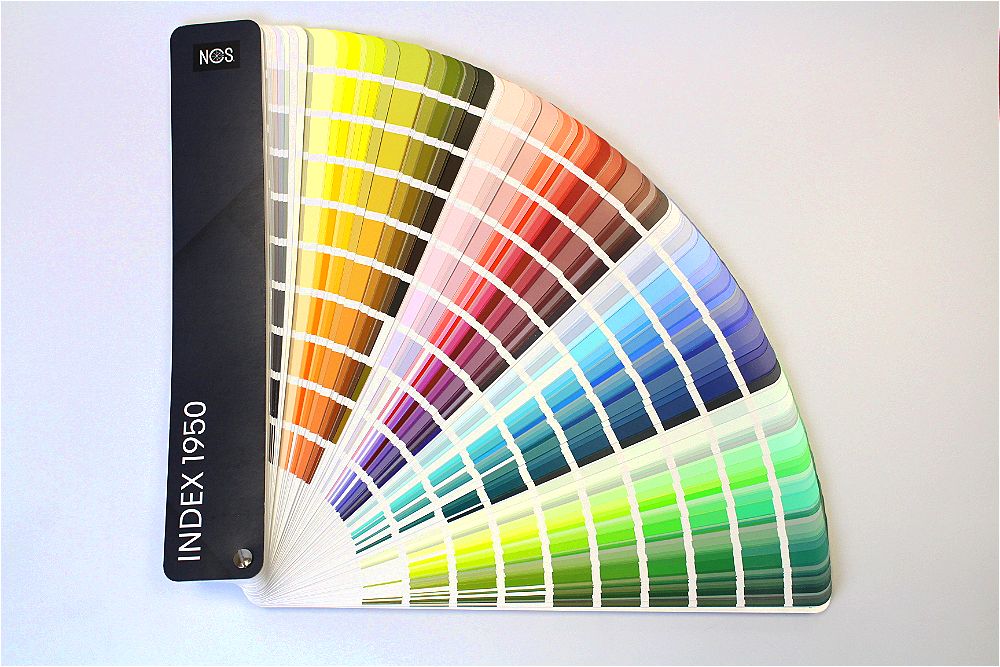
NCS
The Natural Color System (NCS) is a color palette that was first developed and proposed by the Scandinavian Colour Institute in Stockholm. It is based on the comparison of the opposites of hues. Today, NCS is widely used in various industries.
To create descriptions within this scheme, six basic colors are used: white with black, red, green, and blue, as well as yellow. Other colors presented in the system are derived by combining the aforementioned basic colors.
The unique feature of this palette lies in one of the main parameters, which is the proximity of the hue to black. When creating hues, several nuances are considered, including darkness, the "purity" of the color itself, its saturation, and the percentage ratio between the colors from which it is derived.
Today, the Natural Color System is used in nineteen countries and has its own color fan (catalog) dating back to 1950.
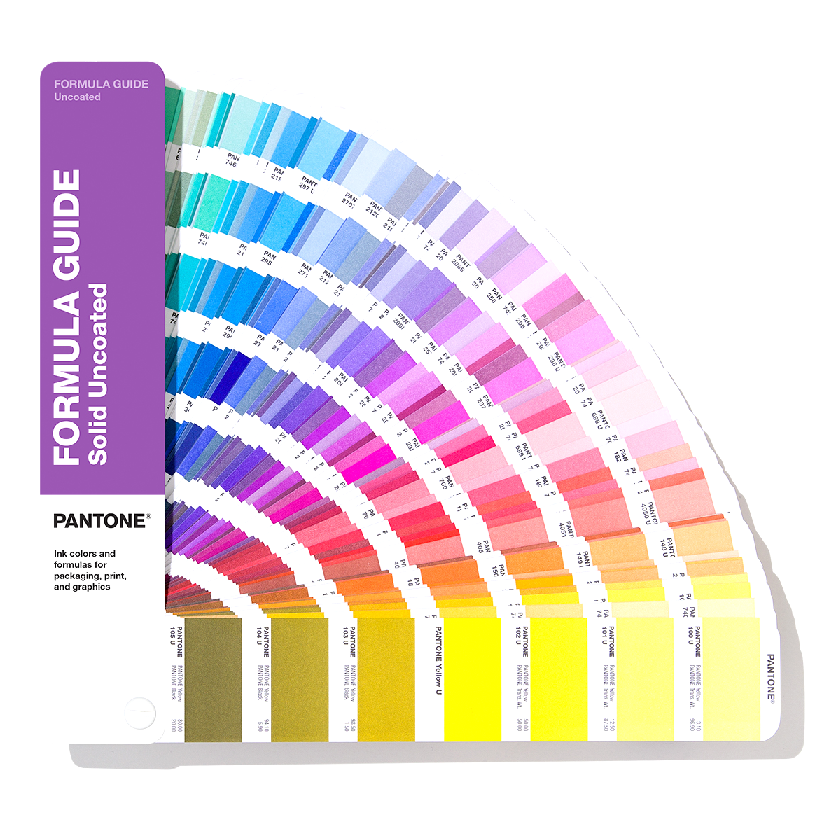
Pantone
It's the Pantone Matching System, created by the eponymous American company in 1963. The main feature of such a color palette is precise digital identification of each shade. In this system, the index consists of values that allow the creation of a hue in a printing facility using both mixed and triadic inks.
The company offers a multitude of color fans, each intended for specific applications of paints. For example, for interior painting, printing on various types of paper, a catalog of metallic coatings, and so on.
Color Models and Everything You Need to Know About Them
Color models, also known as schemes, are sets of numbers used to represent various shades. They are applied to ensure that the final product matches the desired color, and that images on a monitor closely correspond to the resulting output on paper or in paint.
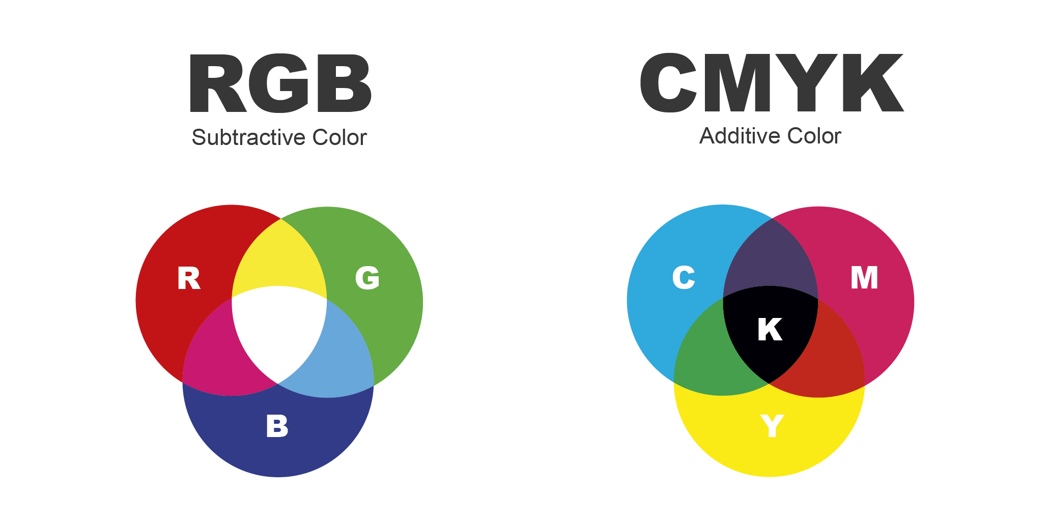
RGB
A popular algorithm that is based on mixing three primary colors - Red, Green, Blue. The ability to obtain a new shade arises when one of the current colors is mixed with black. The main feature of the algorithm is the ability to achieve white color when all three components are combined.
It is commonly believed that the shades in this palette are the most accurate and saturated. However, RGB is rarely used in color printing.
CMYK
A system based on four primary colors - cyan, magenta, yellow, and black. Compared to the previous algorithm, it has fewer options for shades but is used in color mixing for paints or in triadic printing.
The main feature is the creation of new shades by combining the three primary colors and black. In this system, white is completely absent; it will only be present if the material on which the paint is applied has a light tone.
How to Choose Paint Colors: Important Considerations
When choosing the desired color for paint, it is important to consider various nuances:
1. The material and texture of the surface to which the paint is applied directly affect the paint color. Different shades may appear on wood, concrete, and brick, and this needs to be taken into account.
2. Lighting is crucial. Bright natural light from windows can make colors appear dim and desaturated, while evening lighting can impart a gloomy tone. Warm and cool artificial lighting can give a more yellow or bluish tint, respectively.
3. It's best to select shades using tables and digital values directly from catalogs and color schemes rather than making decisions on the spot in a store. Even high-precision monitors can slightly distort colors, which can affect perception.
4. The perception of color is influenced not only by the color itself but also by its proximity to other coatings and materials. Next to gloss, it may appear darker, while next to concrete, it may look rich and bright.
5. The direction of light also matters, where the coating will be applied. In the northern zone, all paints may appear cold, while in the southern zone, they may have a warm and yellowish tone.
An important aspect when choosing is, of course, the price. The cost of coloring and the source materials for it matter. It is not recommended to choose the cheapest white base or inexpensive pigments. As a result, they may fade faster in the sun and have a lower level of brightness than quality paints.
And if you need assistance in choosing paints and want to see how they look - visit our showrooms!
